
Timesheets: Making an Unloved Admin Task Actually Work
Transforming Repetitive Data Entry Into a Quick Check-In
The Problem
Creating a time reporting module that would make the mundane task of entering tasks and time spent on them quick and easy for users transitioning from two different legacy systems. Auditors hated filling in timesheets, managers hated chasing them, and the business needed a unified solution to replace two legacy products that handled time tracking in completely different ways.
Understanding User Pain and Business Needs
Time reporting was tedious administration that nobody enjoyed. The process was time-consuming, requiring users to enter tasks and hours worked for specific time periods. Whether filling weekly, bi-weekly, or monthly timesheets, auditors who didn't log time as they went faced frustrating memory reconstruction. One auditor described the experience: "I sit down on Friday afternoon trying to remember what I did on Monday morning. Half of it's guesswork."
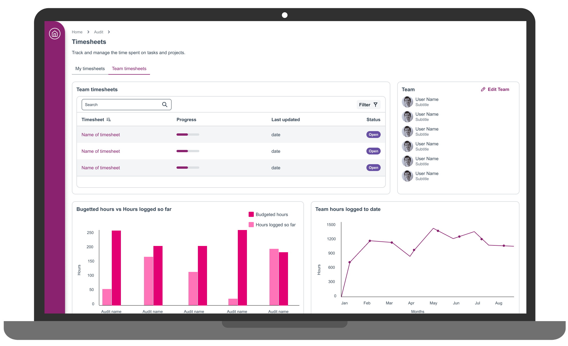
When auditors didn't complete timesheets, managers spent hours chasing submissions and requesting follow-ups. Creating and managing time periods was cumbersome, setting up 52 weekly periods annually, then manually closing and archiving each period after deadlines passed.
The business goal was clear: create an MVP timesheet module that would meet core user needs whilst establishing a foundation for eventual feature parity with legacy products.
“I sit down on Friday afternoon trying to remember what I did on Monday morning. Half of it's guesswork."
Uncovering the Real Problem: It Wasn't Complexity, It Was Repetition
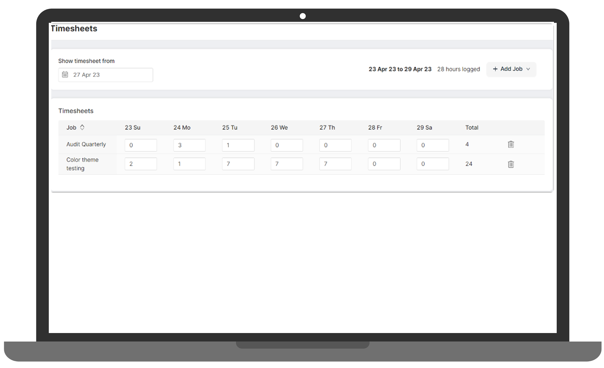
I started by conducting competitive benchmarking, analysing both legacy products to understand how users currently entered time into their timesheets and managed setup. I also researched online competitors like Retain to see how they approached this challenge and identify opportunities for differentiation.
The senior researcher arranged discovery sessions with users from both legacy platforms so we could understand their experiences with the current process and identify pain points. These sessions revealed something important: the problem wasn't just about what users needed to do, it was about when and how often. Auditors weren't resisting timesheets because they were difficult; they were resisting because the systems forced repetitive data entry for tasks that rarely changed week-to-week.
This insight became the foundation of my design approach.
Initial Concept: Minimising Repetitive Entry
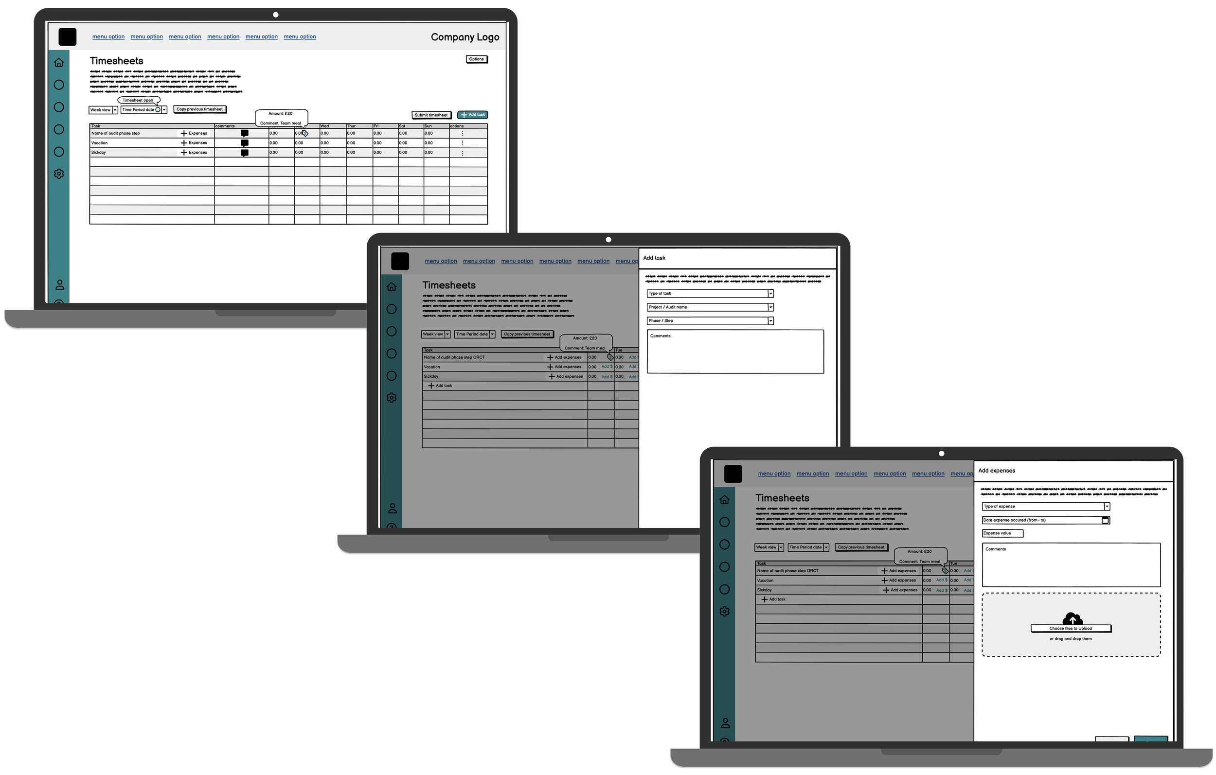
I created low-fidelity wireframes in Balsamiq using insights from discovery sessions and competitive benchmarking, focusing on two core principles: minimise repetitive entry for recurring tasks, and make time tracking feel less like administration and more like a quick check-in.
The wireframes were shared with the product and development teams so technical constraints could be identified upfront before developing the design further. This early cross-functional collaboration caught potential technical limitations before I invested time in high-fidelity designs, a lesson learned from previous projects where late-stage technical constraints forced major redesigns.
Testing and Validation
I created a comprehensive testing plan which the Senior User Researcher used to recruit participants. We spoke to both auditors and managers to test the separate flows created for each user type, ensuring we validated the experience for all user personas.
First Round Testing
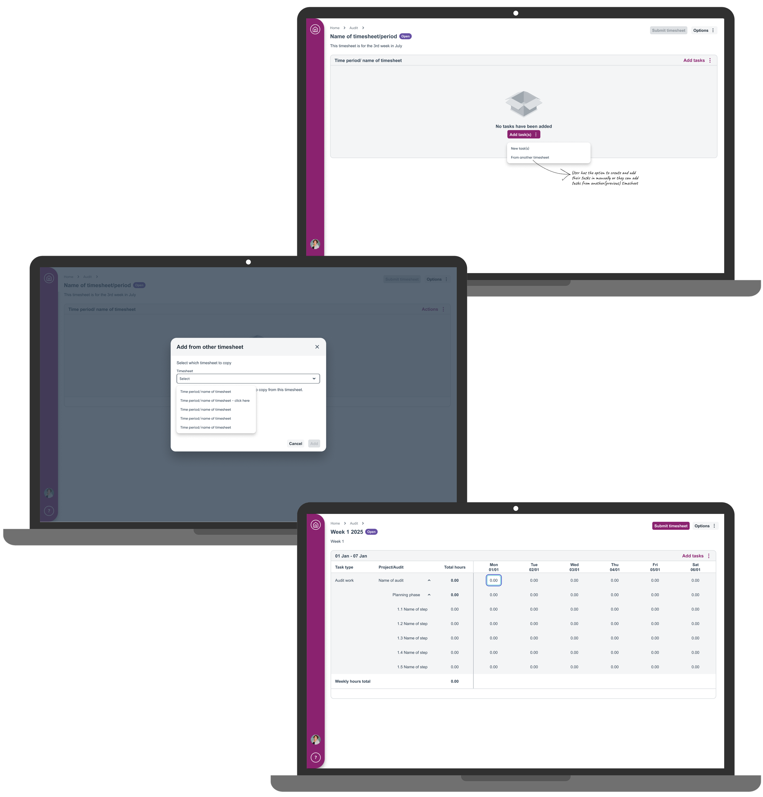
The initial 3-4 usability testing sessions revealed that whilst users loved the bulk copy concept (duplicating previous timesheets and bringing tasks forward automatically), they were confused about when to use it versus starting fresh. I refined the interface to make this distinction clearer through better labelling and subtle visual cues.
Second Round Testing
The revised prototype was tested with a further 3-4 users using an iterative design approach. User comprehension improved noticeably, and the feedback shifted from "I'm not sure what this does" to "This would save me so much time." I gathered insights from this final round and made additional refinements based on observed user behaviour.

Key Design Decisions
Bulk Copy Functionality
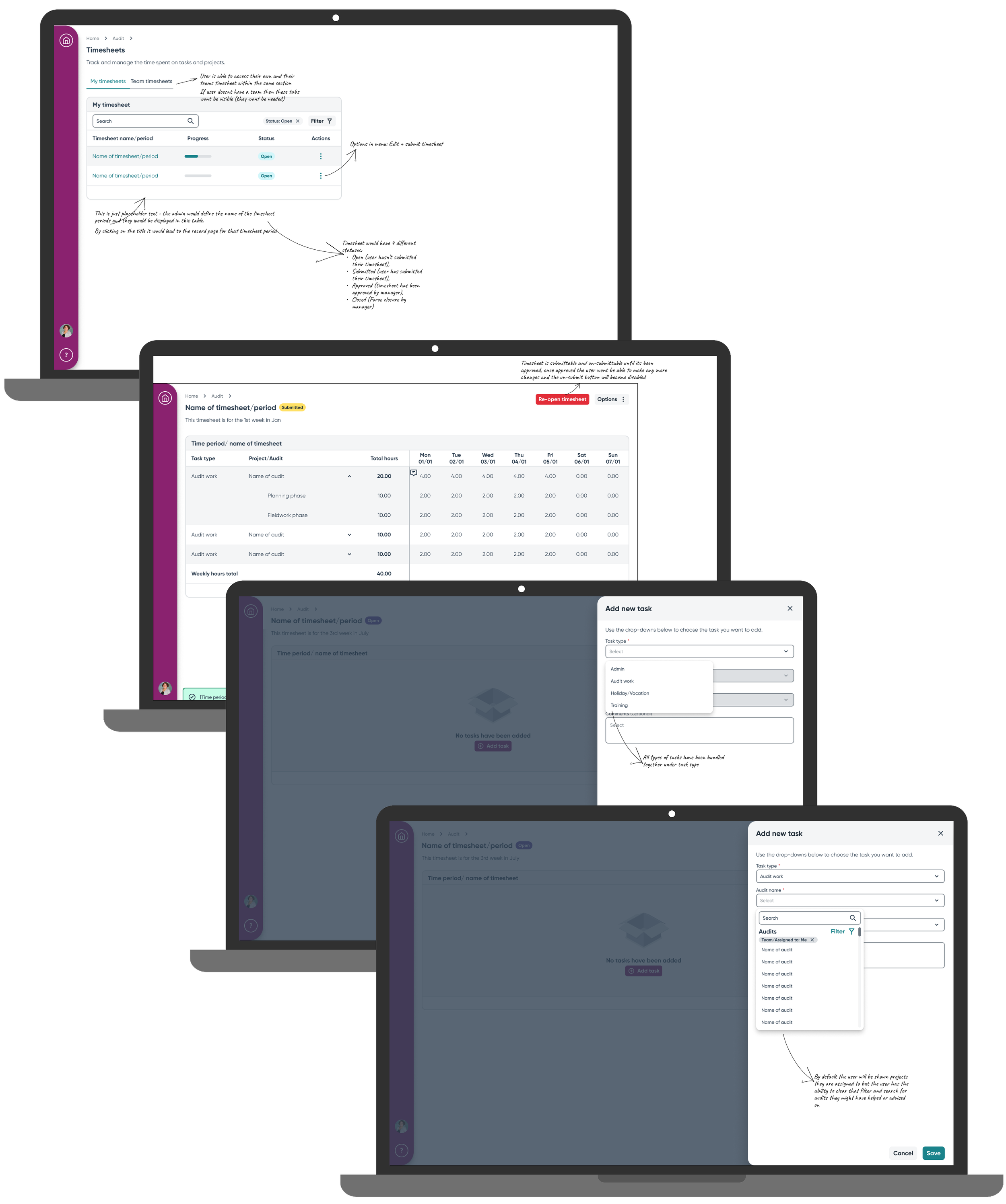
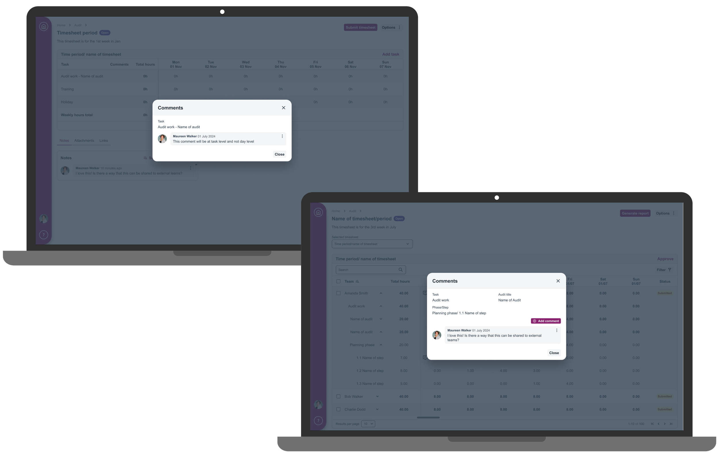
Rather than making users re-enter tasks every period, I designed a feature that duplicated previous timesheets and brought tasks forward automatically. Users could then simply adjust hours as needed. This directly addressed the "recreating the same information" pain point that dominated our research.
Inline Editing
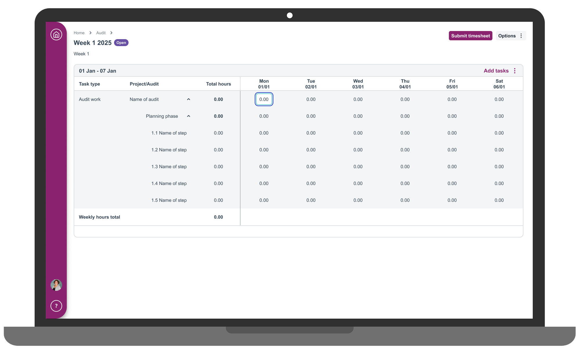
I eliminated separate edit windows entirely. Users could click directly on time cells to make changes within the grid itself. Direct editing within the timesheet grid meant users no longer needed to open separate windows, they could click on any time cell and change it immediately.
Visual Hour Totals
I made total hours prominent and immediately visible. Auditors needed to hit specific targets (typically 37.5 hours), and forcing them to manually calculate across multiple entries was unnecessary cognitive load. Prominent display of total hours helped users immediately identify when they'd reached their target without manual calculation, applying progressive disclosure and information hierarchy principles to surface the most critical information.
The MVP Reality Check: Prioritisation Under Pressure
The proposed design contained too much functionality and had to be stripped down to meet MVP requirements. I had to make difficult prioritisation calls about what would deliver the most value immediately.
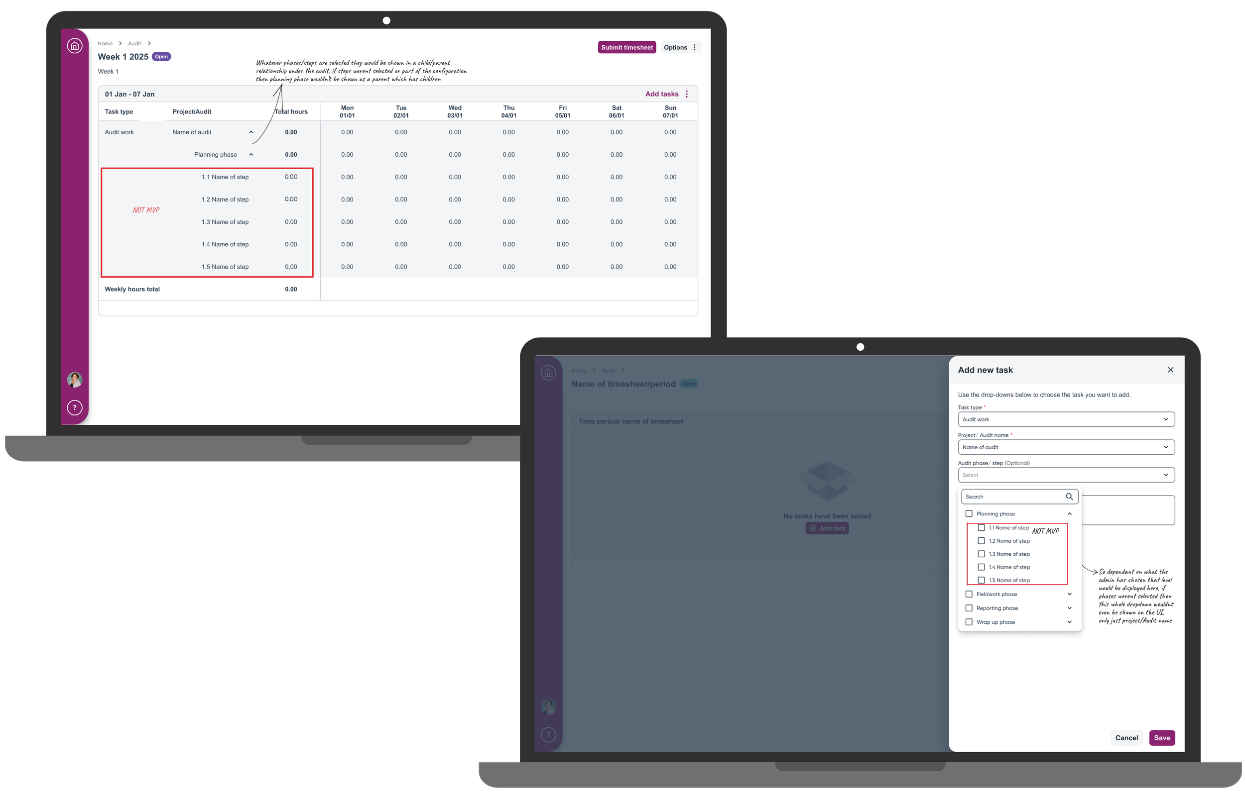
To prioritise core user needs, I removed:
Step-level time tracking within audits
Comment functionality
Bulk period creation tools
These decisions were based on user research findings that showed daily time entry and timesheet completion were the primary pain points, whilst advanced features could be addressed in future iterations. Removed features were documented in a separate Figma file section, ensuring designs would be available for future development phases when capacity allowed. This approach demonstrated strategic design thinking and the ability to balance user needs with business constraints.
Implementation
Design Handoff
The Figma design file was shared with the development and project teams, complete with detailed annotations and justifications for design decisions. This comprehensive documentation helped teams understand the flow and all its components, allowing them to feel more informed and raise questions during the walkthrough. This design systems approach ensured consistency and reduced ambiguity during implementation.
Outcomes
User Feedback
The feedback validated the design decisions:
"The bulk copy feature is amazing. I can duplicate last week's entries and just adjust the hours. Saves me at least 10 minutes per week."
"Having the total hours displayed prominently means I know immediately if I'm at 37.5 hours instead of having to mentally add everything up."
"The inline editing is perfect. I can click directly on a time cell and change it instead of opening a separate edit window."
Business Impact:
Delivered MVP timesheet functionality that enabled product sales to customers requiring time tracking. The solution provided a unified experience for users transitioning from different legacy systems and addressed core user pain points around time entry efficiency and timesheet completion. The design established scalable architecture for future feature development and created a foundation for eventual feature parity with legacy products.
Key Learnings
Understanding the balance between MVP constraints and user needs proved crucial. Whilst we had to reduce functionality for initial release, documenting and preserving the full vision ensured we could deliver comprehensive solutions in future iterations.
Early cross-functional collaboration with the development team caught technical constraints before they became expensive problems. The two-round iterative testing approach allowed me to validate assumptions and refine based on real user behaviour rather than making changes in isolation.
What I'd Change: I would push harder for baseline metrics at the project start. Whilst I don't have post-launch analytics (the platform lacks implementation tracking), having pre-project data about current timesheet completion rates and time spent would have strengthened the business case for specific features. I would also involve the development team even earlier in the ideation process to better understand technical constraints upfront.
Next Steps
Future development should focus on bringing the timesheet module to full feature parity with legacy products. Potential enhancements include AI automation that can prepopulate tasks users have worked on based on calendar events and project assignments, intelligent time estimation suggestions based on historical audit data, and predictive analytics to help managers with resource planning.
Note: Impact measurement is limited by lack of analytics infrastructure on the platform. Quantifying time savings, completion rates, and feature utilisation will require establishing measurement capabilities currently unavailable.