
Unifying two legacy audit systems into one seamless workflow
xkjcnxjkvncxjkvn cxzkv
Overview
My role: Lead Product Designer
Timeline: 6 months
What I did: User research, competitive analysis, wireframing, prototyping, usability testing, iteration
The Context
The company owned two internal audit platforms and a separate risk management system. All three were outdated. The decision was made to build something new from scratch, a unified platform that would bring risk management and internal audit together.
I was brought in to design the audit workflow. This wasn't just another feature. This was the bread and butter of the entire platform. If auditors couldn't carry out their audits properly, nothing else mattered.
The brief was straightforward: make carrying out an audit quick and easy. Users were complaining about too many clicks and information being scattered everywhere.
But there was a catch. We had users coming from two different legacy platforms, each with their own ways of working.
Understanding the mess we were replacing
I started by spending time in both legacy platforms, trying to understand how auditors actually got their work done.
It didn't take long to see why people were frustrated.
Both interfaces were cluttered and confusing. Navigation was poor. The ribbons were packed with icons, some active, some disabled. You'd click into one section to update something, back out, click into another section for something else. Everything felt fragmented.
The platforms didn't even speak the same language. Platform A called the audit process "Audit Work". Platform B called it "Workprogramme". Small difference, but it mattered to users.
The workflows were structured differently too. In Platform A, everything was linked. Objectives connected to risks, which connected to controls, which connected to tests. Each element had to be assessed and signed off individually. Platform B was looser. You could run tests without linking them to anything. You didn't need to assess controls or risks separately.
Platform B used checklists to guide users through their work. Platform A didn't have anything like that.
I had to design something that would work for both groups without alienating either.
Designing a unified flow
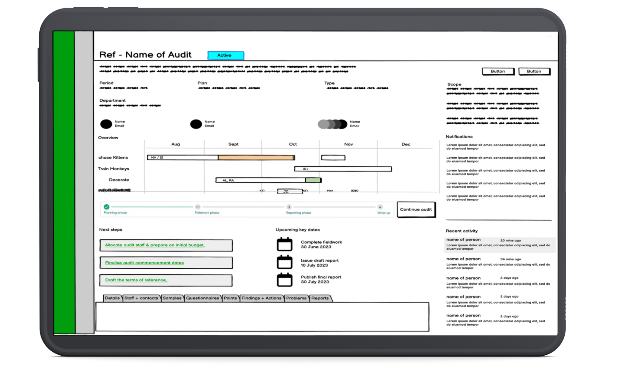
I sketched out some rough wireframes and started mapping out a flow that could accommodate both mental models.
My aim was simple: keep everything in one place, reduce the clicking, and guide people through the process clearly.
I designed three main sections:
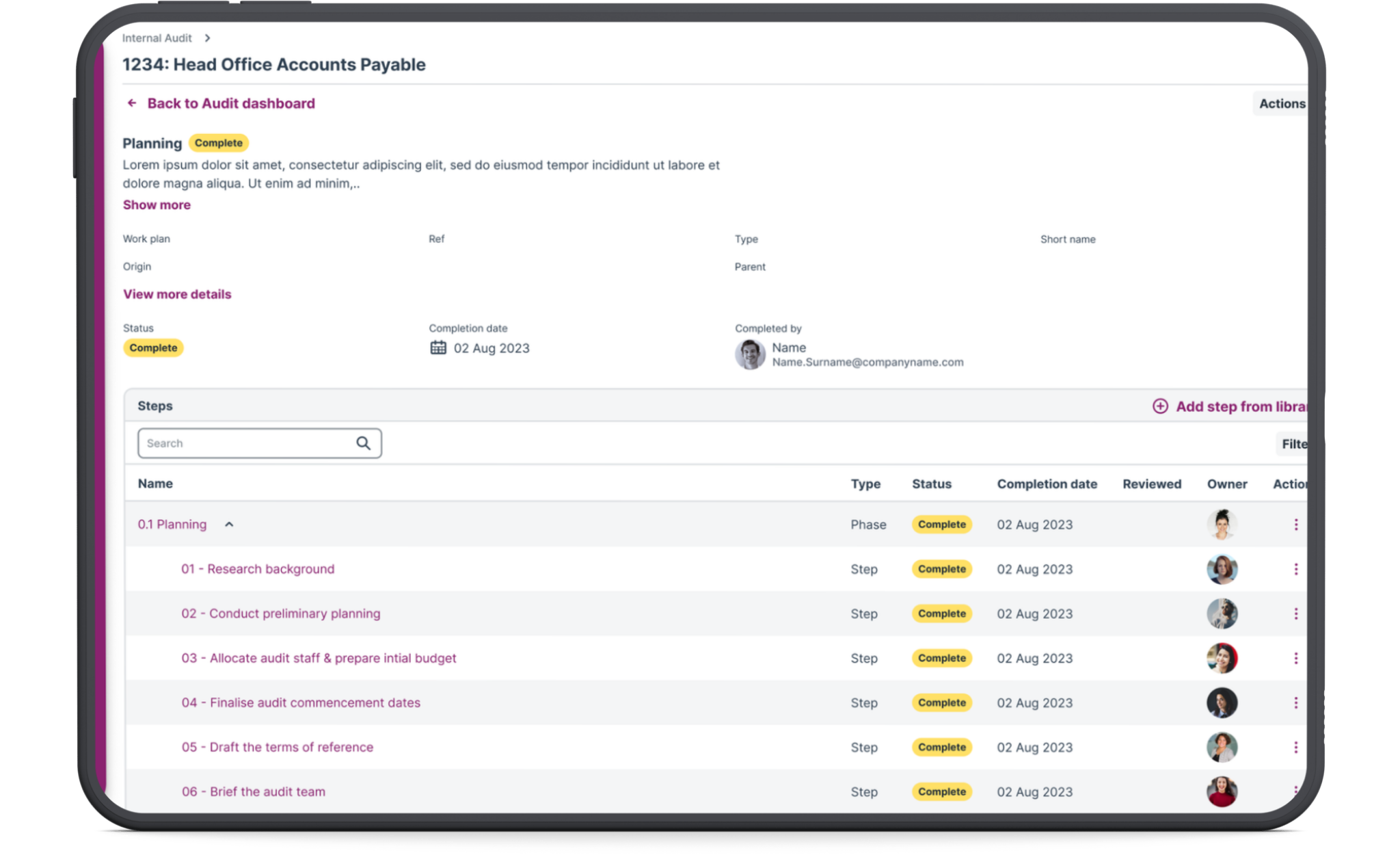
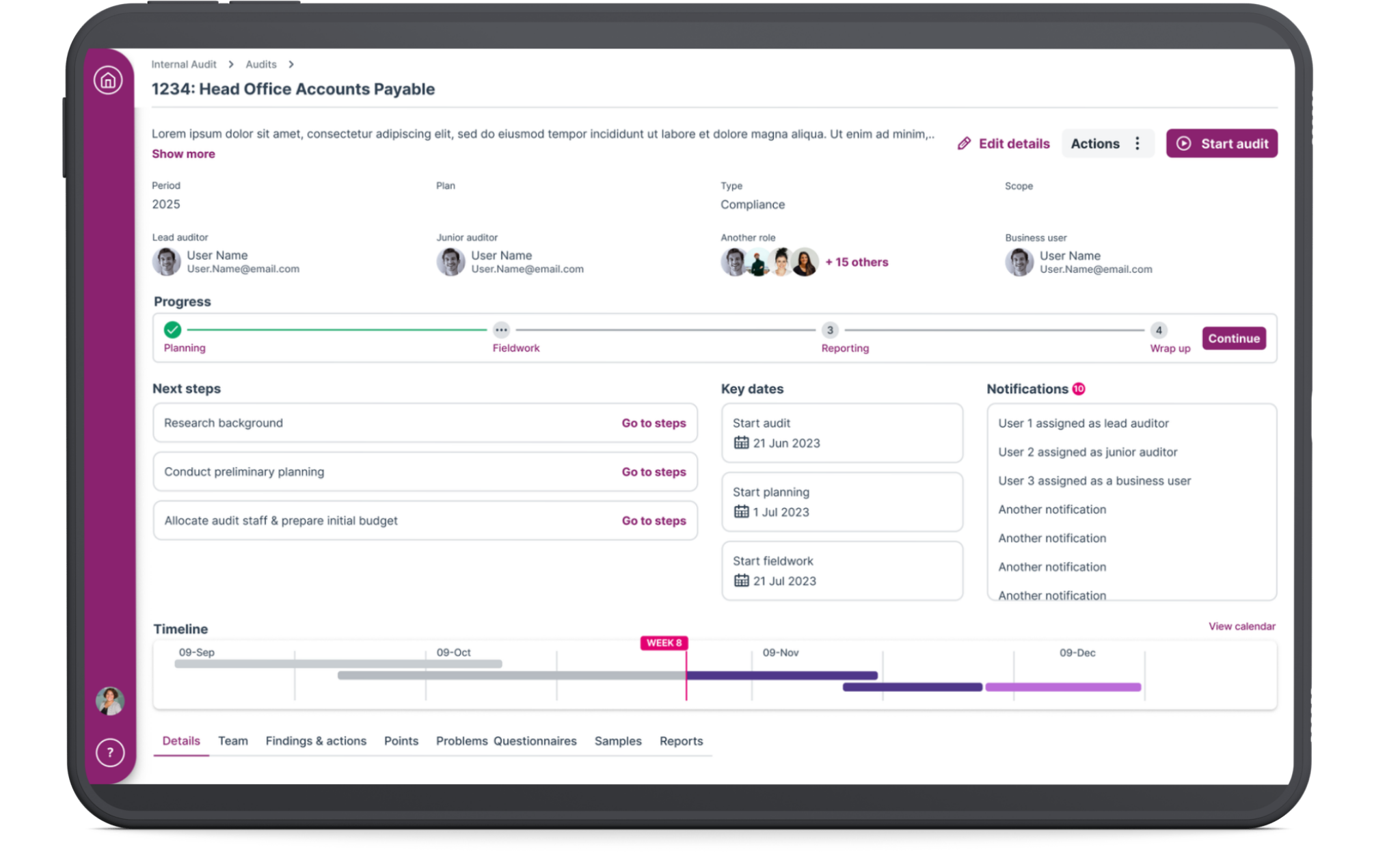
The Audit Hub A home page where auditors could see everything at a glance. Progress on the audit, key information, quick links to different sections, and a timeline showing where they should be versus where they actually are.
Phase and step records A guided workflow that takes users through each milestone. Do this, then do that. Mark steps as complete as you go. Move to the next phase when you're ready. It gives structure without being rigid, and it removes the need for external tracking spreadsheets.
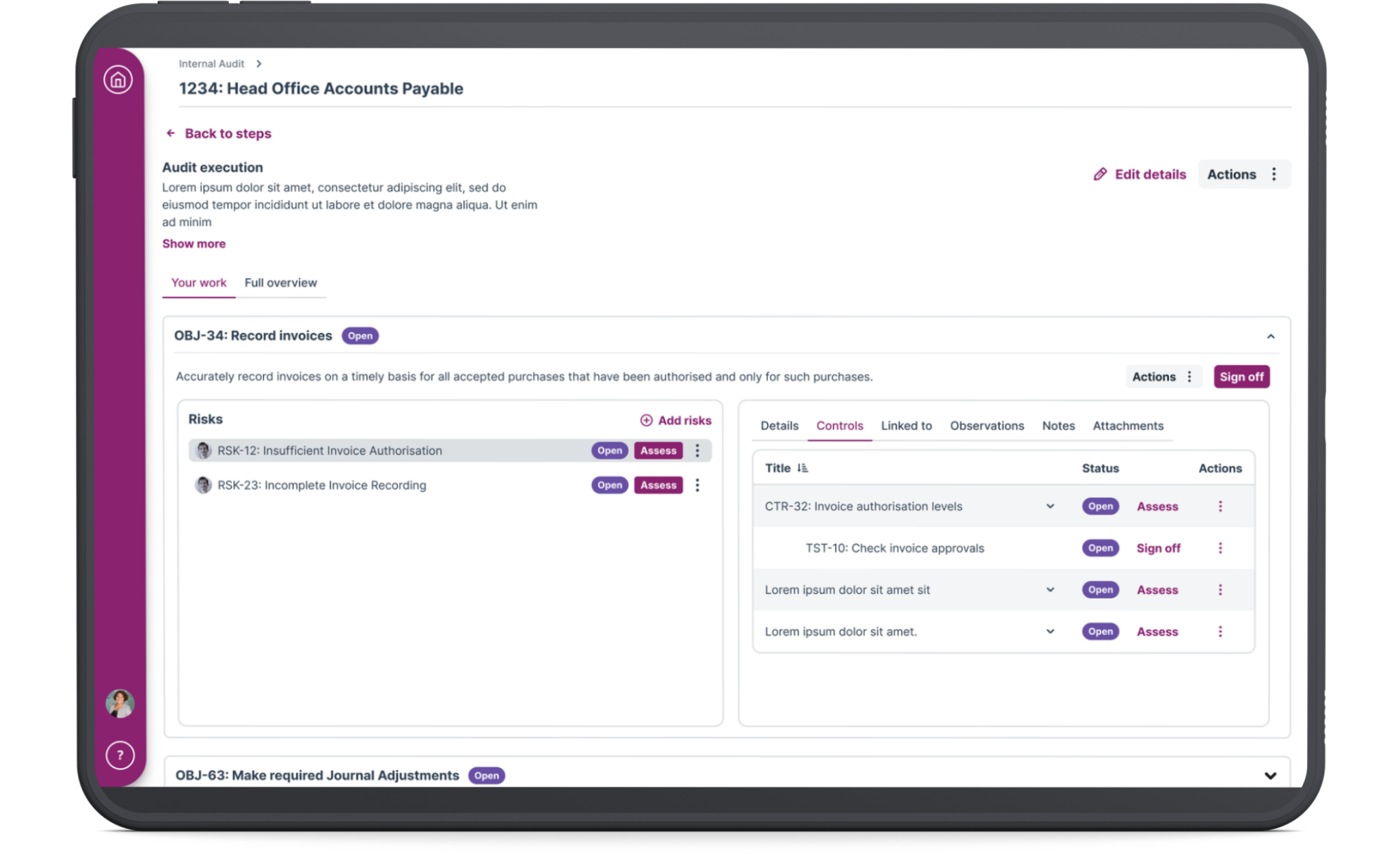
Audit execution This is where the actual assessment work happens. Evaluating risks, controls, tests. I knew this section had to be spot on because it's the heart of the entire audit.
I walked the product owner and PM through the flow. The product owner had a development background and could flag any technical issues early, so we didn't involve the dev team at this stage.
Once we'd aligned on the approach, I built a high-fidelity prototype using the company's design system
Testing with real users
I worked with the senior user researcher to line up 10 users from both legacy platforms for testing. We split the sessions into two parts: first, we talked to them about their current pain points, then we put the prototype in front of them.
The senior researcher ran the first couple of sessions while I observed and asked follow-up questions when I needed clarification.
The feedback was encouraging.
People liked the cleaner interface. One user said: "It's much less clicky, and that's one of our big complaints about the current system. It flows in a way where you can see what comes next."
Another said: "This shows a lot visually on one page, which right now is scattered around different parts of the legacy software."
But there were issues.
The "Sign off" button was causing confusion. Users told us that "Complete" and "Approve" would make more sense because it's a two-step process.
One user wasn't happy with how the audit execution section was laid out. He felt it was too cramped, especially for the most important part of the audit where assessments actually happen.
Users also wanted to see the review flow. This was critical. In the legacy systems, when someone raised a review, the reviewer often didn't get notified. Work would sit there waiting, causing delays and frustration.
Rapid iteration
I made changes quickly.
I swapped "Sign off" for "Mark as complete" on both steps and phases.
I redesigned the audit execution layout completely. Instead of cramming everything into one view, I adopted a hierarchical structure that showed the connections clearly: Objective → Risk → Control → Tests.
I also gave users two ways to work. Some auditors want to assess quickly from a table view. Others want more detail and prefer working through individual record pages. The system needed to support both.
I added the full review flow with proper handoffs and notifications so work wouldn't get stuck waiting for someone who didn't know they had something to review.
Testing round two
We went back to users with the revised prototype.
The changes landed well.
"Mark as complete" achieved 100% comprehension. No one was confused anymore.
The phase and step records worked for both user groups. Platform B users got the checklist-style guidance they were used to. Platform A users already understood the concept of phases and steps.
Most importantly, users were able to complete full audit tasks in testing without reaching for external spreadsheets or tracking systems.
The outcome
I delivered a unified audit workflow that brought together two completely different ways of working without forcing either group to start from scratch.
The consolidated hub eliminated the need to jump between multiple screens. The flexible assessment options meant auditors could work the way that suited them. The embedded review flow stopped coordination failures that were causing delays in the legacy systems.
This workflow became the foundation for the platform's MVP and gave the business a unified product to sell instead of two aging legacy systems. It positioned the platform competitively in the risk management market and gave the company a real chance to win back customers who'd been frustrated for years.
More than anything, it proved that enterprise software doesn't have to be painful. When you take the time to understand how people actually work and design around that, you can build something they'll actually want to use.